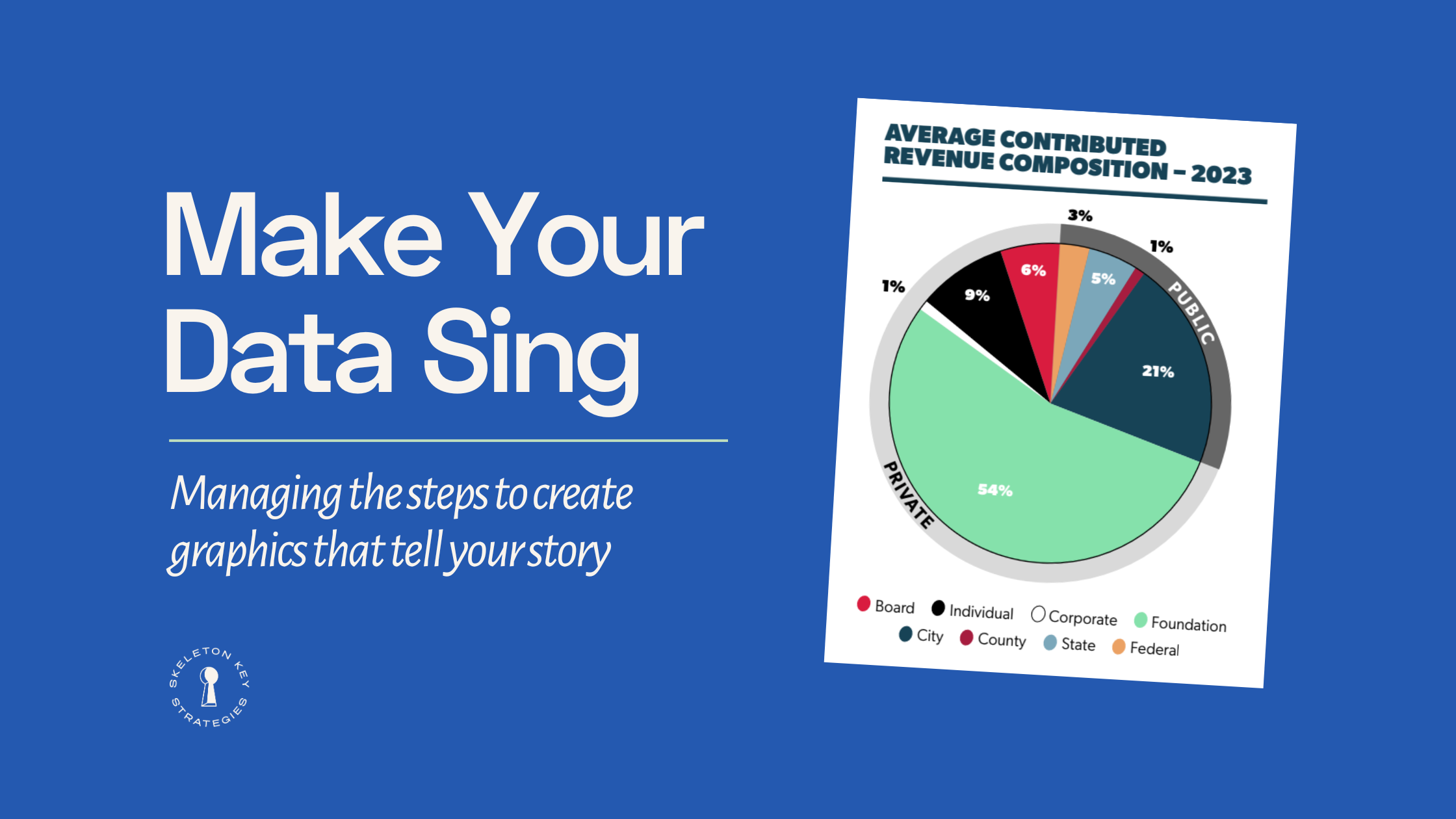
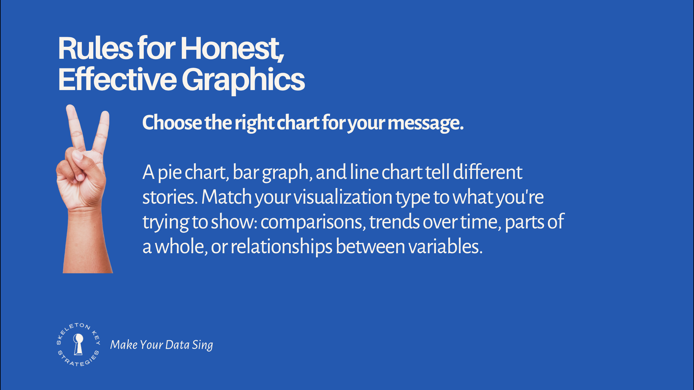
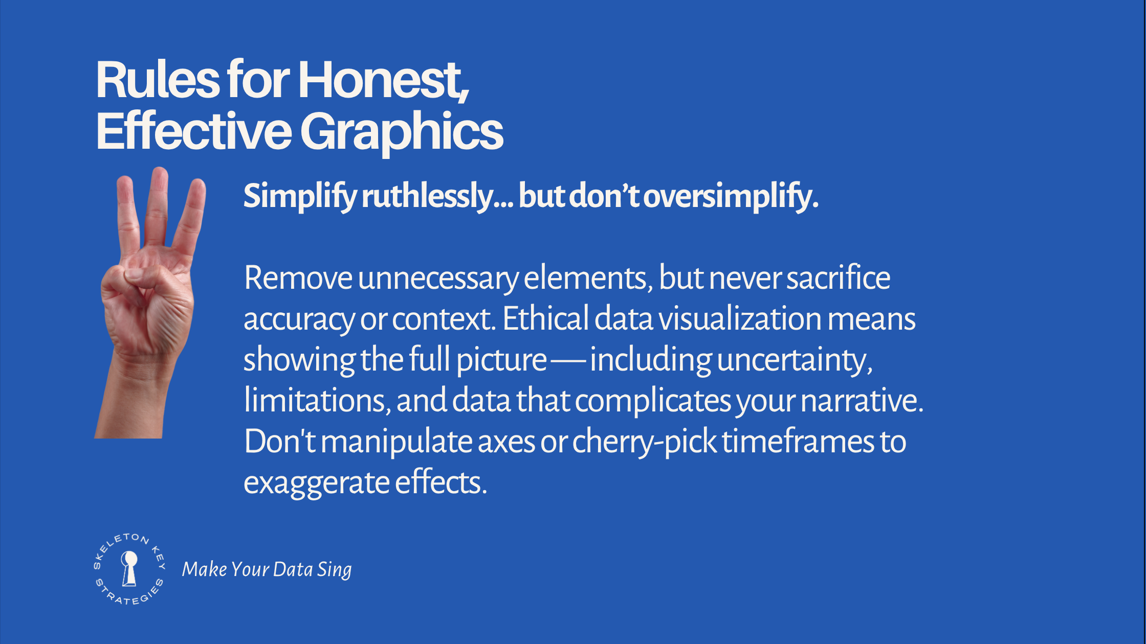
You have the data. (Wait – do you have the data??) You know the story you need to tell. But how do you get from a basic table to a vivid, persuasive infographic?
In the slides below, we share six strategic and tactical principles for creating data visualizations that start conversations with stakeholders — whether you’re building graphics yourself or briefing a professional designer. These ideas draw on our work helping nonprofits like A.R.T./New York transform complex research into advocacy publications that open doors with funders and shape sector-wide conversations.
Share this with team members who are new to the front lines of data storytelling. And reach out if you’d like to talk about how we can support your research and content strategy work, or help you improve your data infrastructure to enable more effective storytelling.
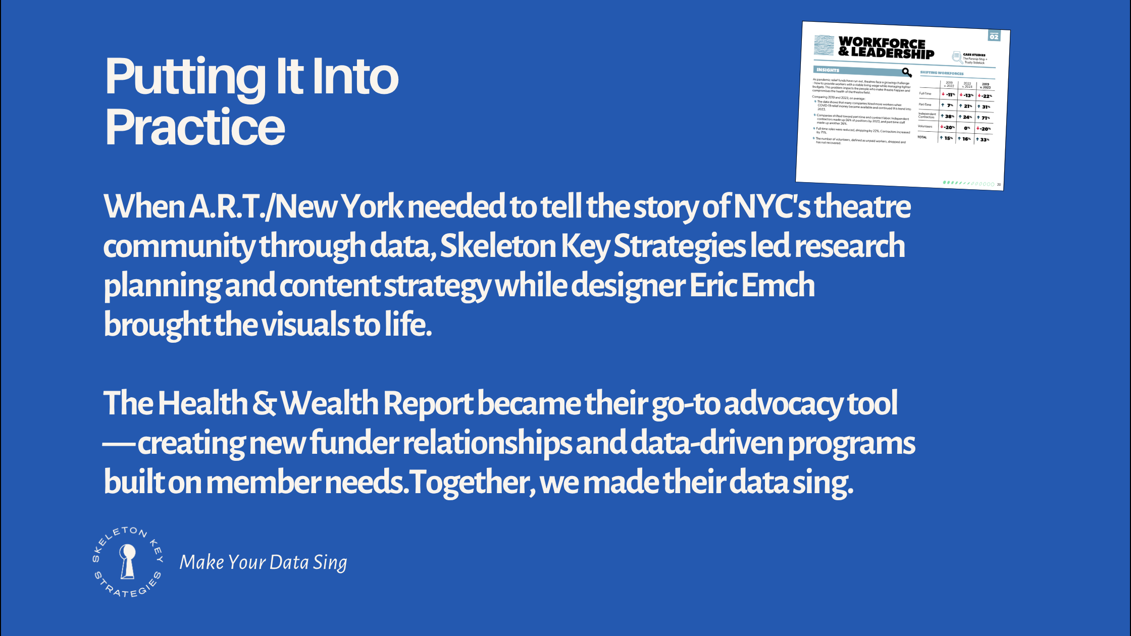
Our strategic partnership with A.R.T./NY, generating new insights on the NYC theatre community
Research Publication Scoping, Planning, and Design; Stakeholder Engagement; Strategic Communications; Developmental Editing and Content Strategy; Graphics and Data Verification; RFP Management; Project Management (2024-2025)
In 2024, the Alliance of Resident Theatres/New York (A.R.T./NY) engaged Skeleton Key Strategies as strategic partner on a comprehensive research project examining the post-pandemic health of NYC’s nonprofit theatre community.
We worked hand-in-hand with A.R.T./NY’s Co-Executive Directors to revamp their approach to gathering member data. This project allowed staff to better understand the membership’s makeup and priorities, tailor their offerings to better serve members, translate findings for a public audience, and build visibility and access to funding for the Off-Broadway ecosystem.